
Campaign poster design for Viridian Nutrition’s Electrolyte Fix product.
The Challenge
Electrolytes have become synonymous with fluorescent colours, artificial flavours and performance-focused sports branding. Viridian's product represented the opposite: naturally sourced minerals from Utah's Great Salt Lake, no added sugar, no preservatives and a cleaner approach to hydration.
The opportunity wasn't just to advertise another electrolyte product; it was to redefine what hydration could look and feel like.
Viridian Nutrition
CAMPAIGN DESIGN | ILLUSTRATION | ART DIRECTION
In 2026, I worked with Viridian Nutrition to develop creative campaign routes for the launch of their 200ml Electrolyte Fix, a product rooted in purity, transparency, and naturally sourced ingredients. The challenge was to create a retail campaign that felt unmistakably Viridian while breaking away from the visual clichés that dominate the hydration category.
Creative Exploration
I developed three distinct creative directions, each exploring a different narrative while remaining rooted in the same strategic foundation.
Hydration, As Nature Intended, explored the product's origins through expressive watercolour landscapes inspired by the Great Salt Lake, connecting the product directly to its natural source.
The Sweat Solution translated the science of hydration into playful illustration, visualising how electrolytes work within the body through simple, engaging graphics.
One Small Drop took a more conceptual approach, using space exploration as a metaphor for discovery and progress, positioning hydration as a small daily action with an outsized impact.
Each route balanced storytelling with commercial clarity, giving the client multiple ways to communicate the product while staying true to Viridian's ethical and natural brand positioning.
The Result
The project demonstrates how strategic thinking can transform even a highly functional product into an emotionally engaging brand experience.
By challenging category conventions and focusing on simplicity, authenticity and natural provenance, the campaign concepts helped position Viridian's electrolyte range as a refreshing alternative within an increasingly crowded market.
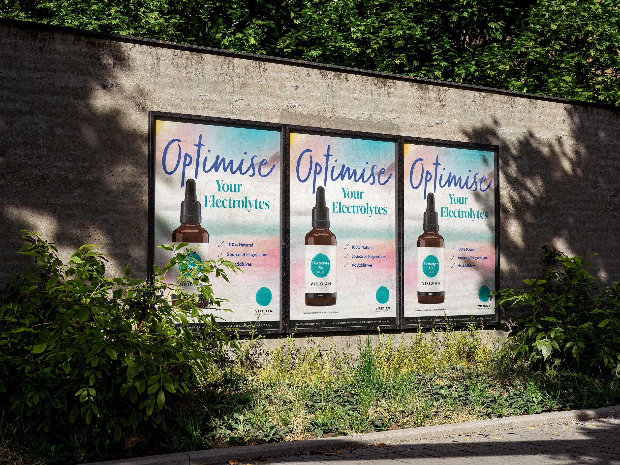
Campaign poster development.
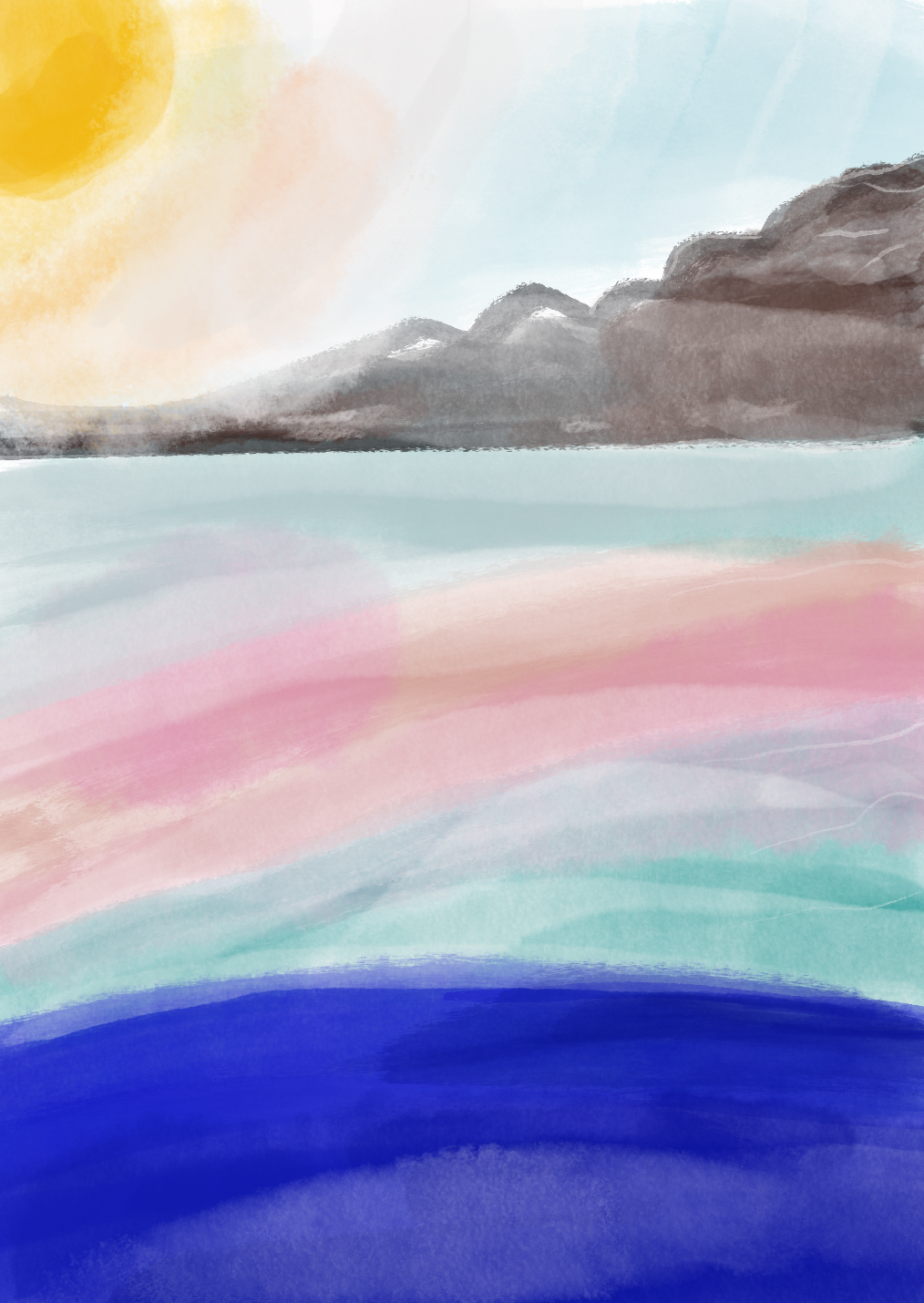
Watercolour landscapes.
“The campaign has been so well received, with wonderful feedback… the beauty of the artwork is wonderful.”
CAMPAIGN MANAGER, VIRIDIAN
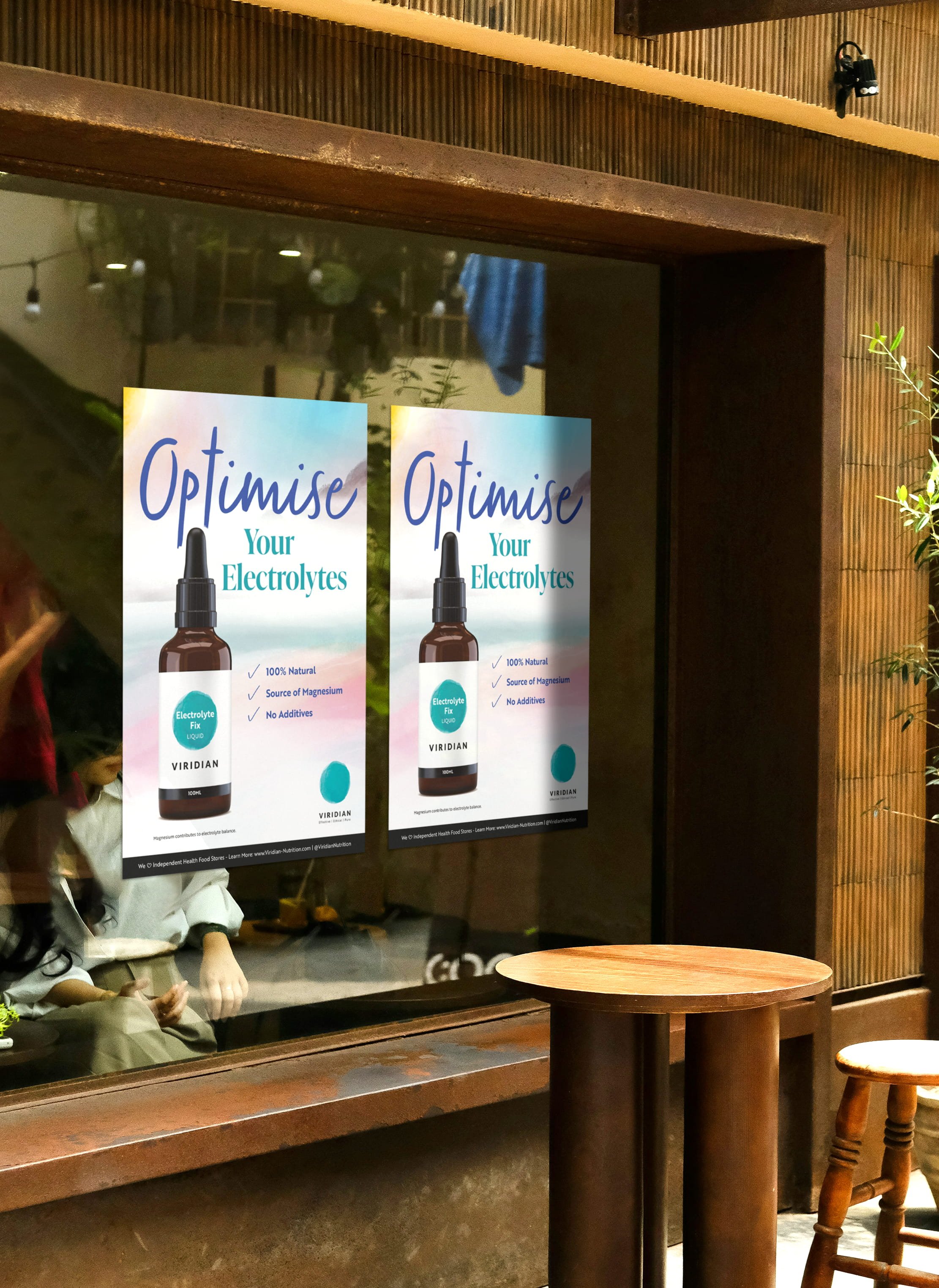
Poster design applied to retail space.
How can we fix hydration?
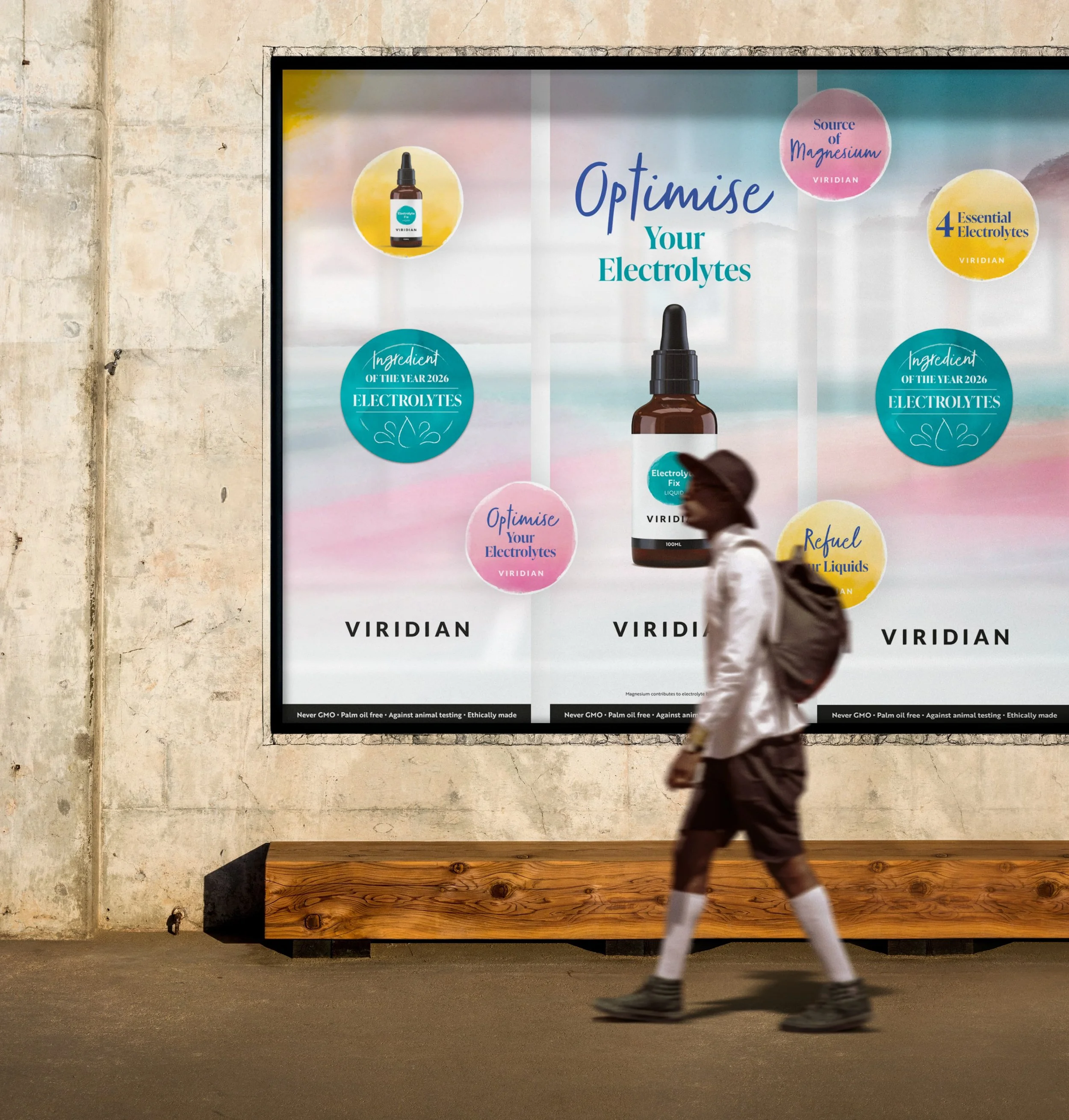
Campaign banner development.
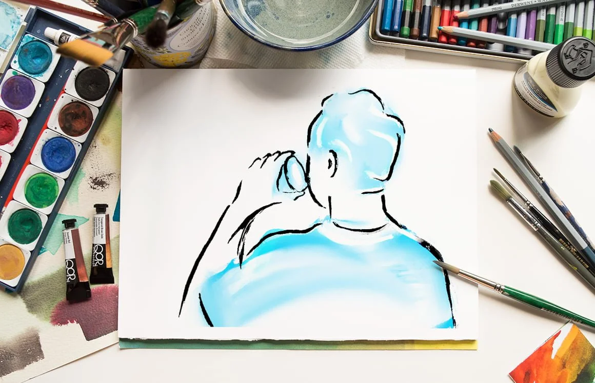
Exploring Viridian’s signature line-work.
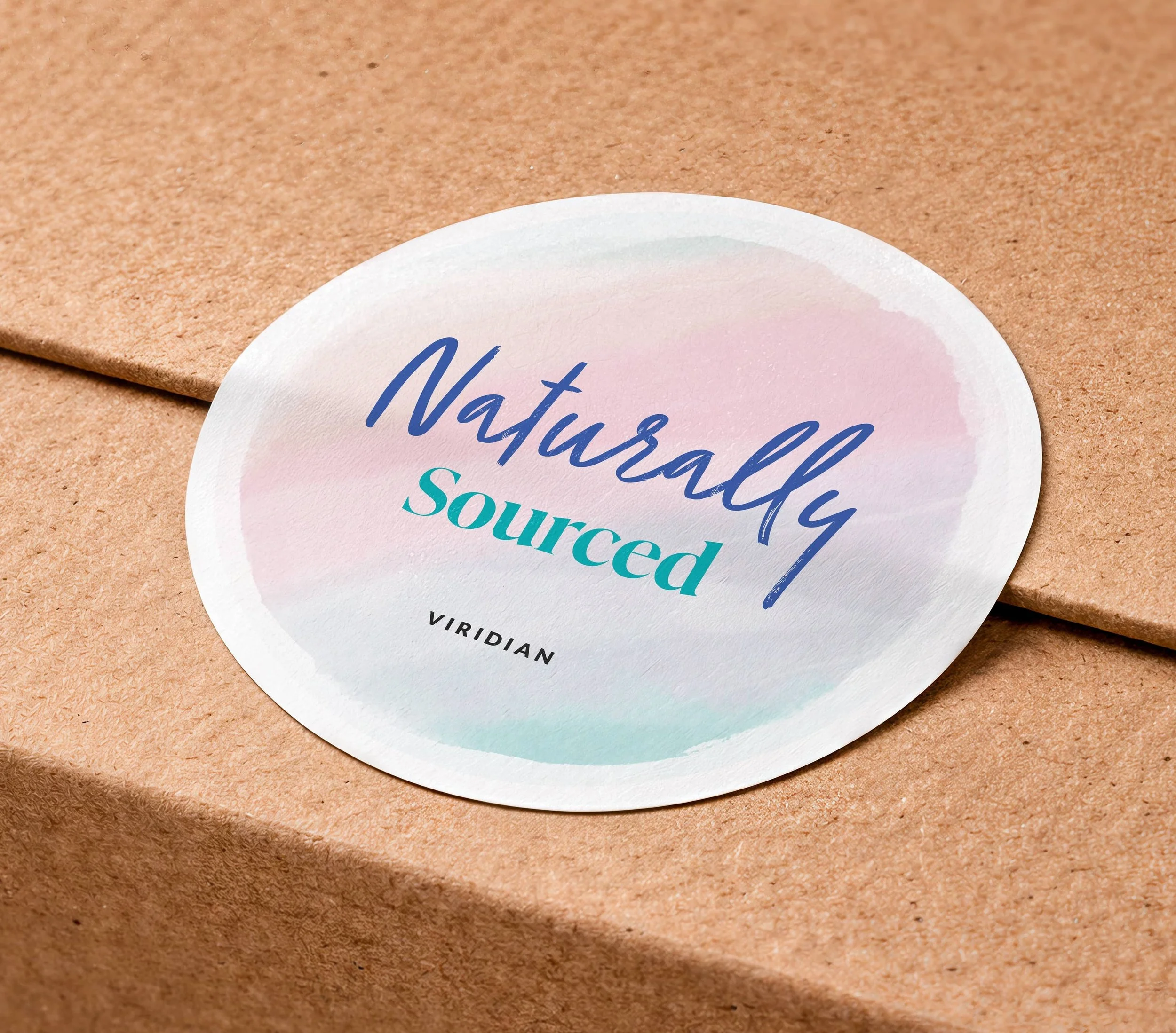
Window circle exploration.